How I Love Thee, Sarah Richardson
Okay so I might be mildly obsessesed with Canadian Designer, Sarah Richardson. It all started with her show Design Inc. on Fine Living Network (DirectTV) and now her show Sarah's House which is currently airing the second season is my new addiction.
Design Inc. follows her design firm team as they design space for clients. This show would actually make me feel better about jobs I was working on because it not only shows the great work they do, but it also shows the problems that come up on each project. It made me feel less crazy when I had an issue with a client =)
My other addiction, Sarah's House, follows her through the process of renovating entire houses. The first season turned out awesome and now they are airing her second renovation project.
Sarah's Cottage
This show has not aired in the US yet, but the photos are up on her website and I love, love, love...
Living and Dining Room
Kitchen Lounge Area
Kitchen
Love the colors, love the tile work and that "Groceries" sign is adorable...
West Guest Room
The combination of fabrics in this room is something one might not think of, but pull it all together in this room and it looks great.
East Guest Room
I love the old fashioned warm feeling in brass/antique brass. It really makes everything feel that much more homey.
Bathroom
Seriously, how happy is this bathroom. Love the windows and skylight over the tub. The vanity is adorable and even though the tile work is a little more modern, the furnishings and accessories keep it true to the style of the rest of the house.
Hallway to Powder Bath, Upstairs Deck and Guest Bungalow
The red cabinets are something I would never think to do, but it looks fantastic. The guest bungalow is lovely and do I really need to say anything about the deck?
Other Projects form Sarah Richardson and Design Inc...
Living Spaces
Kitchens
This kitchen is traditional and modern all rolled into one. Love the backsplash and the stainless countertops around the range.
This room was intriguing to me because it broke out of her usual blues and greens that she tends to use a lot of. I love the warmth and again, great backsplash.
Taking a break from the white cabinets and going with something dark.
Bedrooms
Black, white and kelly green was a big trend that came with Kelly Wearstler, but Sarah's take on it seems much more livable to me.
Absolutely adore the vintage chest painted white. She does a great job of reinventing pieces she finds at flea markets and consignment/thrift stores.


Nurseries
Of course I couldn't get through this entry without talking baby stuff. I love that her babies rooms aren't over-the-tip annoying. They are young, but sophisticated and one won't get sick of the decor. One might notice a common piece of furniture in each babies room. The Zoe Nursery Chair is one of Sarah's pieces and for a glider it's fabulous. It's not too chunky or frumpy. It's definitely on my wish list for the nursery.
Love the combo of red and light blue in the first picture. It doesn't come off as patriotic, just airy and beachy. Also love the stenciled tree in the second photo.
Love the hooks and towel bar next to the changing table in the second picture, great idea.
Bathrooms
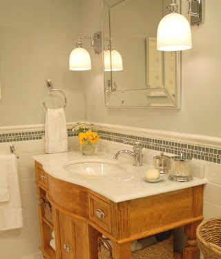
Sarah's bathroom vanities/consoles are always so original and great looking. Love the warmth of this wood with the white tile.


No comments:
Post a Comment